The easiest way to get new users to activate
⬜️ Well designed empty states ⬜️
Today, we're going to dive into the art of designing a compelling and engaging empty state for your SaaS product. This might seem like a small part of the user experience, but it's actually a critical piece of the puzzle when it comes to building a product that users love and engage with.
Learning how to properly design and leverage an empty state will significantly boost your user engagement and product adoption. A well-crafted empty state is like a friendly tour guide, helping your users navigate your product for the first time and turning a potentially confusing or overwhelming experience into a pleasant journey.
Unfortunately, many product builders overlook the significance of the empty state. They're often so engrossed in imagining their product bustling with activity and filled with data, they forget about that first moment when a user lands on an empty, untouched platform.
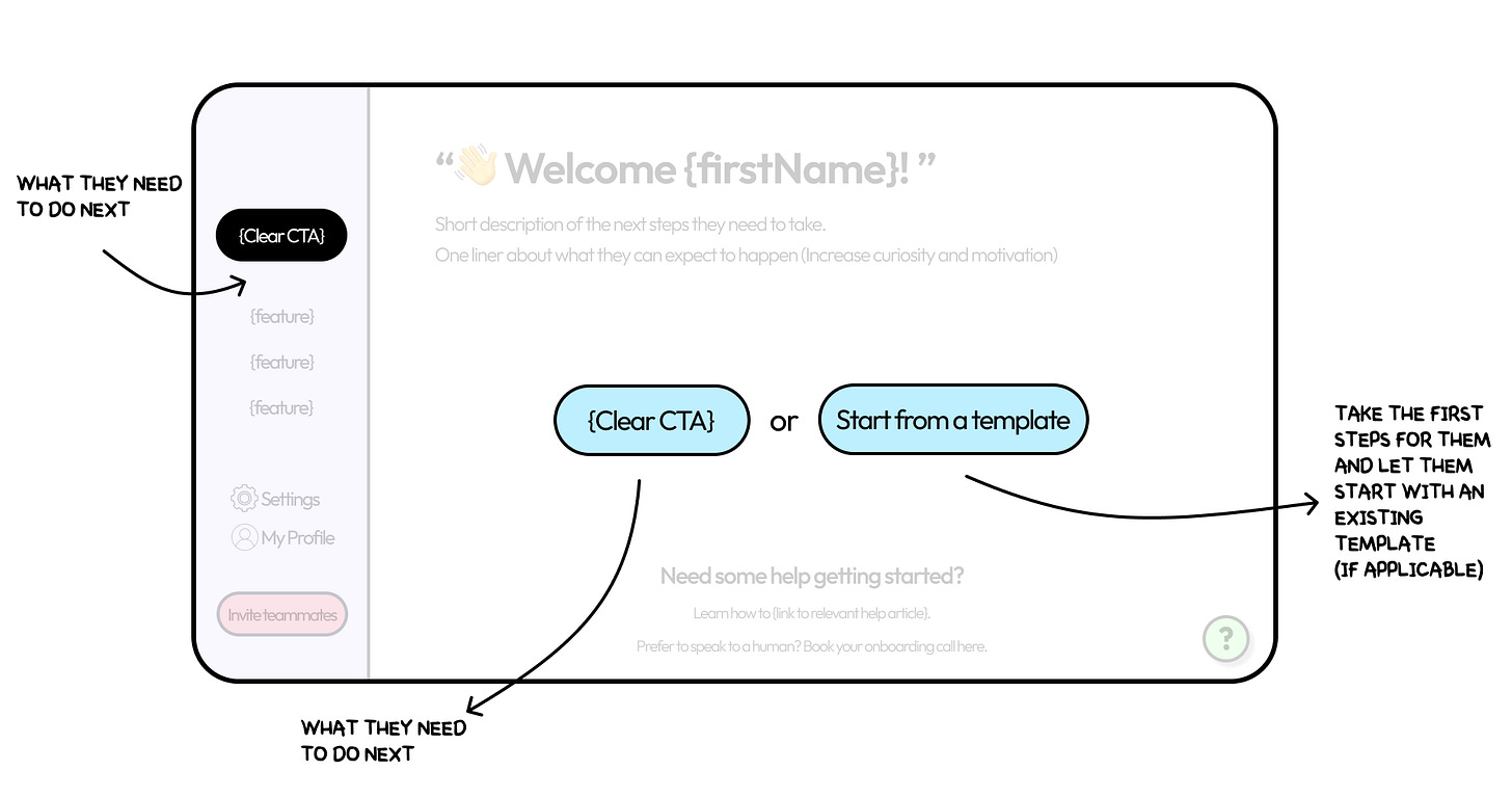
So, let's break down this example and delve into the key components that you need to consider when designing your product's empty state:
A personalized welcome
In the example of above I’ve included the most basic warm introduction by welcoming the new user by their first name, but you should play around with what works for your specific product.
The goal here is to make a positive, human-like first impression and increase the user’s excitement and motivation.
“Remember that a person's name is to that person, the sweetest and most important sound in any language” - Dale Carnegie
Example template: Welcome aboard, {firstName}! {productName} is ready to {value proposition}.
Let's say you've developed a project management tool called ProjectMaster. Your welcome message could be, "Welcome aboard, Yaakov! ProjectMaster is ready to help you manage your projects seamlessly."
A clear description
A user's first few interactions with your product are critical to their long-term engagement.
Without clear guidance, they may feel lost and overwhelmed, which can lead to churn.
Providing a simple and clear explanation of what to do next can remove that initial uncertainty and smooth the onboarding process.
Adding a one-liner about what they can expect to happen is an easy and powerful way to increase their curiosity and motivation to take the next step and reach their first milestone.
Check out how Mixpanel has nailed this in both their set up screen and in their product’s first empty state:
A Clear CTA
The call to action (CTA) is one of the most powerful tools in your user engagement toolkit. A clear CTA will get users to instantly start interacting with your product, turning their passive interest into active engagement.
Simply ask yourself what’s the next step you want the user to take, and then make that the CTA.
Continuing on Mixpanel’s example above - The first step they need users to take is to create a board, so that’s exactly what they ask them to do.
Providing an option to start from a template can give users a useful starting point and speed up their time-to-value.
By asking the right questions in the onboarding process you should also be able to personalize this experience further and suggest templates based on their specific desired outcomes (You can see more about personalization in my previous post here.)
Help and Support
Even with the most intuitive product design, some users will inevitably encounter difficulties or have questions.
By providing easily accessible help and support, you can ensure these users don't get frustrated and abandon your product.
This could take the form of a FAQ page, a chatbot for instant help, a series of tutorial videos and articles, or any combination of these.
Navigation
Everything they need should be accessible on the page. Good navigation is fundamental to a good user experience.
It helps users easily find what they're looking for and discover what else your product has to offer. By making all necessary features easily accessible, you can prevent user frustration and make their interaction with your product smoother and more enjoyable.
Collaboration
If your product is designed for collaboration, enabling users to invite others will help spread your product via internal expansion and word-of-mouth.
A new user might have not even thought about inviting their teammates yet and this is where a simple CTA or pop-up can make the world of the difference. Facilitating collaboration from the beginning can help establish your product as a central part of a team's workflow.
Empty state cheat sheet
Conclusion
Remember, every great journey starts with a single step - and in the world of SaaS products, that step is often the empty state.
Your product's empty state is a unique opportunity to create a positive first impression, guide your users during their initial interaction with your product, and start building a meaningful relationship with them. By investing time and effort into designing an effective empty state, you can turn this often overlooked part of your product into a powerful tool for user engagement and retention.
Thanks for reading!


